Quick & Tasty app intro screens

The Challenge

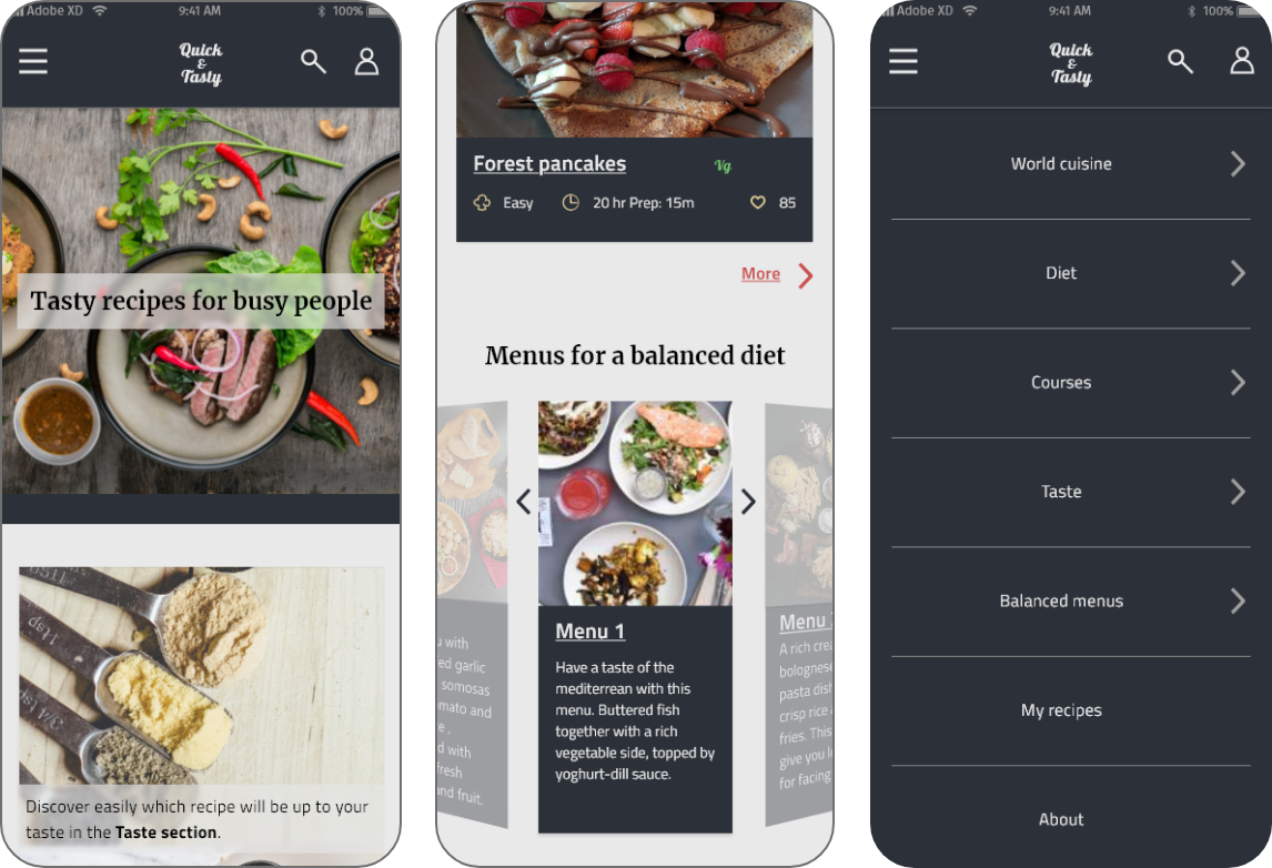
The challenge was to create a recipe web app. The result was Quick & Tasty, a recipe app with quick and easy-to-make meals, where the user can find something by taste or also choose one of the available menus to make sure the meal will be healthy and balanced.

The Process

magnifying glass lens in front of a person
1
Discovery
Competitor Analysis
icon of a recipe book

Apps had many categories and recipes

Different websites offered a subscription to a tailored meal planner

No apps offered the possibility of creating your own custom balanced meal by placing different recipes in the same day menu.

User interviews
question mark

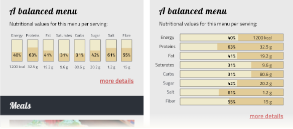
Do people want healthy and balanced recipes?

The prevalent user need was finding quick and easy recipes for tasty meals.

magnifying glass lens in front of a person
2
Definition
App Features
  • Recipe app focused on easy and quick recipes
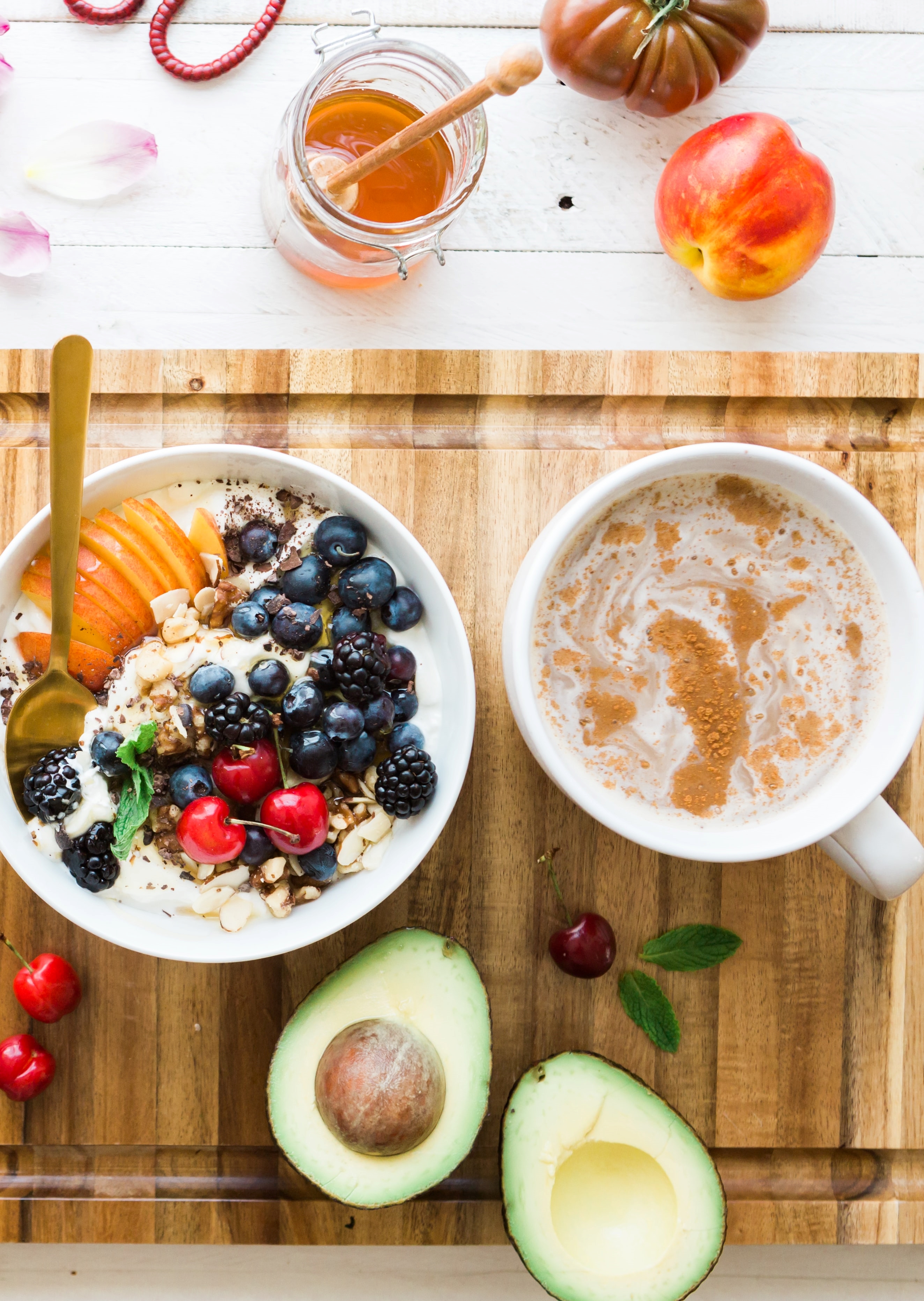
  • Easy-to-find ingredients
  • Possibility to choose according to taste, country, diet
  • Add your own recipes to the app
bowls with food on the table
magnifying glass lens in front of a person
3
Rough prototype & testing

I created some wireframes and a rough prototype with those.

Then I conducted a usability test.

 
Pain points from the test

Users did not understand the section had both the liked recipes and the user ones.

solution: changing the label in "My Recipes and Favourites"

Users were expecting to find the personal recipes link in the hamburger menu.

solution: added link from the hamburger menu to the My Recipes and Favourites section.

The section had different categories, such as Recent or By Meal, so users could scroll through their own personal recipe book. The users found the UI confusing.

solution: deleted the tabs and added a filter button for a more familiar filtration of the recipes.

magnifying glass lens in front of a person
4
Hi-fi screens & a/b Testing

I created the style guide and the high-fidelity screens.

 
Preference Test

I ran a A/B test to clear some doubts.

60% of the participants liked more Choice 1. From this test I also understood participants preferred to have less categories, so I decreased the categories to 5.

magnifying glass lens in front of a person
5
Finalization

I created the responsive screens and finished working on the high-fidelity screens.


Icons inside the discovery section are from the Noun project. Authors: Tippawan Sookruay, monkik, Nithinan Tatah.

User Needs & Solutions

“I usually cook quickly something easy”

Solution:
A collection of recipes that can be made quickly with easy-to-find ingredients

“I choose what to eat according to what I feel like eating at the moment”

Solution:
Taste filters to get quickly to what you want

The mobile screens. one next to the other. One screen shows filters with choices for difficulty, time and taste. The other shows some recipes under the category of Sweet taste.
“I have my own family recipes or use Google to search for something”

Solution:
Add your recipes to the app and have everything in one place.

The mobile screens. one next to the other. One screen shows filters with choices for difficulty, time and taste. The other shows some recipes under the category of Sweet taste.
“Sometimes I want to cook something from a certain country, or a specific diet type. I pay attention to eat healthy.”

Solution:
The app menu has different sections for each need: World cuisine, Diet and Balanced menus.

The mobile screens. one next to the other. One screen shows filters with choices for difficulty, time and taste. The other shows some recipes under the category of Sweet taste.

Responsive screens

The mobile screens. one next to the other. One screen shows filters with choices for difficulty, time and taste. The other shows some recipes under the category of Sweet taste.

Final screens

the mobile home screen has a hero image showing 3 dishes, on top there is written Tasty recipes for busy people the second part of the home screen has some recipes and at the end some menus the login screen with an input field for email and one for the password the register screen with input fields for Email, Password and a last one for confirming the password the open menu. Here the user can access to: World cuisine, Diet, Courses, Taste, Balanced menus, My recipes and the About section tapping on the taste section, the user gets to this screen. There are different buttons, each for a different taste type. screen showing the profile picture, a button for editing and deleting the profile, and a bottom section with a title My recipes & favourites the edit recipe screen has a picture and multiple input fields, from the recipe title, to its difficulty, taste, time and ingredients screen showing the menu section. There is an image of the menu and different info the filter screen where the user can choose difficulty, time, and taste a screen showing the sweet taste categories, holding different recipes within it the recipe screen has an image at the top with the recipe title. Below there are many info, like the nutritional info and recipe steps screen showing the second part of the recipe page.
The mobile screens. one next to the other. One screen shows filters with choices for difficulty, time and taste. The other shows some recipes under the category of Sweet taste.