This student project allowed me to learn about the Material Design guidelines and also the Human Interface guidelines, implementing them in a new concept app.
UI and UX Designer
iOS
Android
Process
Searching for a custom shopping experience
Firstly I analysed the current market. I looked at competitors apps, checking what features they had in common but also what made each app different. I've analysed the flow of the user experience and what function felt more useful to me as a user. I then checked what kind of new innovative functions are being implemented in the retail sector through digital devices. I ran into some interesting findings, like the usage of beacons to notify the user of a new upcoming event when walking near a shop. However, there wasn't an app that would provide a good personalised recommendation section from the first moment the user gets into the app.
I also realised how
clothing apps should not limited to online shopping, but
could used to enhance the experience in shops too.
As a UX designer, it seemed to me those apps were trying to
push their products on the users, instead of understanding
the user needs first. While I could understand how a number
of shoppers might want to just follow the latest fashion
trends, I also thought some might be more picky and
therefore that could have been the audience for my app.
Shopping enhancing: requesting a size through the app
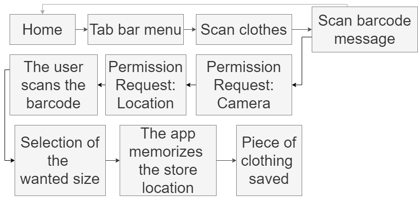
I created some quick sketches of how the app could be, then I made the user stories and eventually the flow charts.

Concerns about gender identities and inclusion
During the initial screens creation I ran in a few
issues.
The first one was gender related. During the registration
process I could have asked to the users to enter their
gender and let that set whether the following clothes images
would have been for men or women. However, this approach did
not feel very inclusive and people from the LGBTQ+ community
could find it quite outdated. I was also wondering how could
I make my app appealing to gender fluid people too. I did
some research, but it seemed websites and apps have the
clothes divided by men, women, and perhaps girls and boys.
Therefore I decided I would have only one main section and
include images of many different styles, from feminine ones,
to boyish and neutral ones.


Testing
Before moving to the high fidelity wireframes, I needed to test my wireframes. I created quickly two prototypes (one iOS and one Android) and had a few people testing it. This way I have found some pain points that needed fixing.

High fidelity
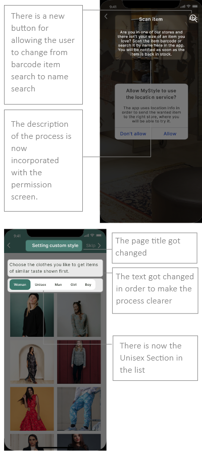
I created the high fidelity screens that I would have used for the prototype. While assigning the pictures to the Registration and customization process, I realised the screen could have been very confusing. If I used a mix of images showing both men and women wearing different types of clothes in the same screen, users might mistakenly think there is a problem with the app. Therefore I added the classic sections: man, woman, girl and boy. I have however paid attention to include gender neutral clothes in each one.

Prototyping & Gathering feedback
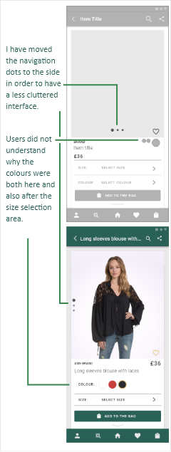
Afterwards I created a prototype and asked for feedback from my classmates. This process was very valuable, as it allowed me to find further weak points but also have a global view of the good ones within the app. I was particularly concerned by the process for scanning an item, because it required a good number of taps and screens due to the permissions needed for the function. Here there is some of the feedback I received.

Screens corrections
The feedback gathered allowed me to fix different issues. These are the resulting screens for scanning items and the one for style customization.

Final screens

Takeaways
Reflection on the project
The project went quite well. If I had the opportunity to work on a similar project again, I think I would approach a few things differently. I would interview a few people early on to make sure my assumptions are correct and I would try to gather feedback on my wireframes through a face-to-face interview or a video call. While different people appreciated the features I have implemented in my app, I think it would be better to gather some data early on and have that guiding the project.
Possible future implementations
In a second iteration, I would push further the app abilities to enhance the user shopping experience. The app could provide notifications when the user is nearby shopping and there is some new item that follows the custom style established. Perhaps this feature could be activated during a certain time range, like weekends only, so it would not bother the user in the morning while commuting.