
My Role: UI / UX Designer
Tools: Miro, Adobe XD
The Challenge
Book Pop is a concept app that was firstly created during one of the Adobe Creative Jams, in 7 days. Me and another CareerFoundry student collaborated on its creation, pushing it further after the creative jam ended. Book Pop is aimed at parents that wants to swap children books, allowing them to create and join events in a Covid-safe environment.
The Process


We checked different apps related to books and events, to understand what was already available on the market. We liked how the books were shown as a list and we analysed the information displayed for books and events.


We decided the app should use bright colours and round shapes and have some nice illustrations inside it, so parents and children would use the app together to look at the books available at the different events.


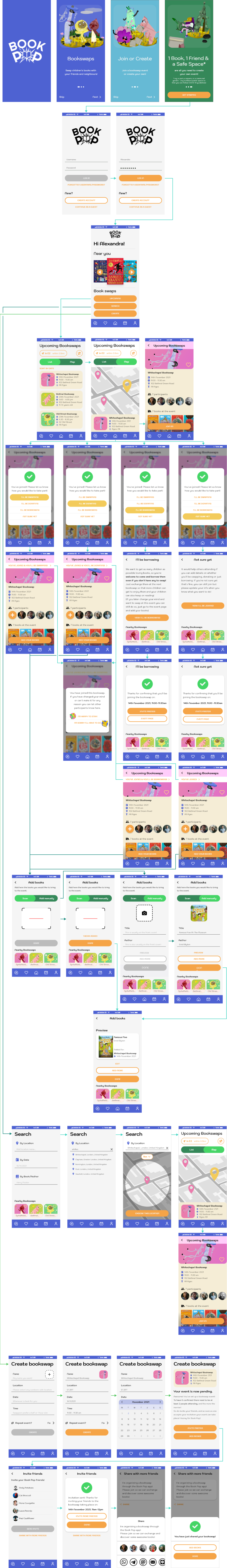
We thought the app main will have a system for joining and creating events and possibly a section were the child can check out all the books available and like some. This section would have a character to guide the child through the app.


From our wireframes emerged two different approaches for showing the events, one using a map and the other using a list. The map would allow the user to immediately spot events nearby, however the list allows an easy comparison between the events, viewing immediately details such as time and target age. We decided it could be useful to have both of them and the user could simply change from one to the other.

We decided the home screen would show the books available at nearby future events. It seemed important to us to show some books in the main screen since books are the topic of the app. We also noticed similar apps were doing the same, which encouraged us to move towards this direction.
We found challenging creating the event screen, in particular showing all the info in a clean way and also keeping the "Join in" button always on screen and recognizable from the background. One trick that aided us was making the participants and books section horizontally scrollable.


Since we did not have much time, we did not create the icons and illustrations ourselves but used some from Icons 4 Design, Noun Project and Ouch!.
User Needs & Solutions
“I want to find book swapping events so I can swap / borrow / donate books”
Solution:
The app allows users to find upcoming events. The user will
get asked when joining if they want to swap, donate or borrow
books.

“I want to create events so I can invite my friends and the neighbours”
Solution:
The user can create events and invite friends.

“I want to be able to see who will come to the event and what books I will find.”
Solution:
The event page has a list with the participants and with the
books that they will bring.

High fidelity screens

Further edits
After the creative jam, we made some further edits to the app. My teammate made some testing: a survey and some usability testing. That way we wanted to see if people were actually interested in the app and what was working well. Some of the big changes we made were:
- Removing the books on the home page, since the user found them confusing and did not understand those were books that you could find to nearby events.
- Showing some upcoming events right from the home screen. Our reasoning was that other events apps also were showing those on the home page and also it felt the most useful to one, since it would display upcoming evnts nearby.
From mobile app to web app
We got in touch with some volunteer developers and decided to change the project into a web
app, since for them it would have been easier to make a web app rather than a native one.
The major changes that I have applied as I updated the screens are the addition of the footer
to all the pages and the disappearance of the tab bar. I have also
reduced the amount of features so we could launch with a Minimum
Viable Product. We established it was essential to be able to create and join the events, but the feature of adding the books you would bring to the event was not so important for the moment.

Reflections
This is how far we got with this project. While currently there isn't an online web-app to try, the project taught us a lot of things.
- It is important the project is created with a clear structure (like components and styles) from the start. During the creative jam, we started with a proper structure but eventually things got chaotic as the time was running out. Because of it, when we tried to further develop the project we had to spend much time on fixing components and similar.
- We should have tested the project idea further before thinking of moving on toward the development. My design partner found out about the importance of creating a smoke screen or a concierge MVP that should be made before moving on with the development phase. It was great to learn about it, even though it meant we missed essential steps during our attempt to create this product.
- By working together on the same design file in Adobe XD, we learned good practices in order to discuss any changes and ideas effectively. One of our best ways to deal with this was to create annotations around the artboards, each one of us using a different colour for the text so it would be immediately recognizable who was the author.
To sum up, the project was a great learning experience and we managed to improve our understanding on collaborating with other people and of product development. Even though we did not launch it, we think when it will be the right time we might get back into it.